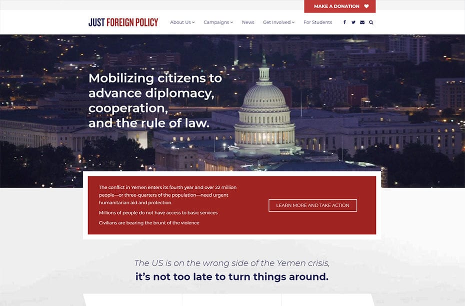
Located in Washington D.C., Just Foreign Policy is a non-partisan advocacy group promoting international diplomacy and cooperation. They needed a fast and lean redesign to elevate their work to stop the war in Yemen in 2018. As a small organization, Just Foreign Policy focuses on specific policy campaigns at a time. Their new website allows them to publish rich content and engage audiences around strategic calls to action.
Why Viv
Our Creative Director, Kalman Gacs, worked with Just Foreign Policy co-director and award-winning musician, Hassan El-Tayyab, on a music website. Having seen our ability to build effective and engaging websites on a tight budget and timeline, he hired us again for this project.
The Results
The new Just Foreign Policy website is based on a flexible CMS build-up, using the Viv toolkit of proven design elements and development functionalities to optimize user experience and content flows.
Improved Functionality
One of the pain points of the previous website was that it was not mobile-friendly. We ensured the new version was responsive and optimized for every device, so that the campaign content can reach people in various contexts of their busy lives.
Speaking of content, we had to eliminate a lot of it to make the website less busy and prioritize the most important calls to action.
A content-rich site also warrants a stellar search functionality. Offering the search bar in a large format invites heavy use of this tool, so users can find what they are looking for.
Building Authority
Given Just Foreign Policy’s mission to affect meaningful change in international relations, its website must convey credibility in both its content and its design.
The website redesign coincided with a dramatic moment in the organization’s work. For the first time in 20 years, the impending war in Yemen invoked the use of the war powers resolution. As a small organization that was leading the charge to turn around the Yemen crisis, it was important to have a solid website to center the conversation and amplify their impact.
We relied on high-quality stock images rather than custom photography to keep the project lean. The images we selected through a custom search stick to neutral colors and government themes to communicate a patriotic feel and inspire action.
There is a certain gravity that we are communicating throughout – white text on dark imagery, as well as the font choices, which are authoritative and objective.
We knew the importance of lending credibility to the news on the website. To assist the internal team in restructuring the content and make it succinct, clear, and impactful, we rewrote existing headlines and major calls to action.
The use of bigger pictures for the staff and board of director pages helps personalize the organization and lend credibility to its leadership.
Elevating Specific Campaigns
A large content migration to a new website requires development expertise to avoid bugs.
For this migration, we made sure the content that lives front and center is focused and streamlined. The new messaging gives major emphasis to one campaign rather than distracting the user with information from too many campaigns at once.
Fundraising in Focus
As opposed to keeping the donate call to action as a main menu item, the new website pulls it out more prominently above the main menu, using a red background and capital letters to make direct users’ attention toward it.
We also worked Salsa Labs to make sure they integrated the exact header to make the donation platform feel seamless, in addition to integrating the email sign-up list with Salsa.
The Power of a World-Class CMS
This website is built on WordPress, which facilitates a natural ability to post news.
The content drives traffic to this website, with a blog post providing the typical entry point. On the former website, content was organized into five streams, which also structured the action alerts that went out over email. Showing these five streams on the website created a constant need for fresh content that led to lulls, giving the website a dead impression at times. To help address this issue, we unified the content into one stream, but made use of tagging and categorization to maintain the granularity needed for those who want to search by specific content types. This approach respects the time of the internal team and demonstrates our sensitivity towards the need for a redesign realistic to the typical pace of posting.
WordPress also empowers internal team members to make heavy use of categorization and tagging, which organizes the content and makes the site easy to search.
Amplifying User Engagement
Social media is a key mechanisms for sharing news and mobilizing more people around a campaign. The social icons on the new Just foreign Policy website are prominent and travel with users as they scroll, inviting users to share articles and engage their own social networks around them.
The ability to embed social media posts into the website was crucial, as well, to demonstrate leadership in shaping foreign policy dialogue and showcase engagement on Twitter and Facebook.
Users also have the ability to sign up for action alerts and the organization’s email list.
The email list consists of over 12,000 people and includes many influential policy advocates and legislators, so the website has to play in concert with that and link prominently to campaign materials.
In addition to legislators, advocates, and the general public, students are another critical audience for the organization. However, they interact with the website differently than the other stakeholder groups, so we created a custom-page, where they can take advantage of unique opportunities, such as signing up to be a campus advocate or a summer fellow.

