For more than 30 years, Families First has been a leader in providing parenting education across the Greater Boston area. Together, we refreshed their outdated website to better align with their identity as a forward-thinking, evidence-based organization.
Why Viv
We were invited to respond to a formal Request for Proposals after reaching out to the Families First team. We knew from the onset that there would be budget constraints, so we were able to build a proposal around our ability to be nimble, work as part of an in-house team and our willingness to invest our own time into templates that we could leverage for future projects.
The Viv Toolkit
As with many non-profit projects, we faced some budget constraints, so this redesign happened in two phases and benefitted from close collaboration between us and the stellar in-house team. Every dollar we could save Families First was a dollar they will use to help communities thrive.
By allowing us to reuse some of our design resources and to invest in a template that other non-profits could use, the Families First team was able to get more for their budget than they would have with a more conventional agency partner.
The Results
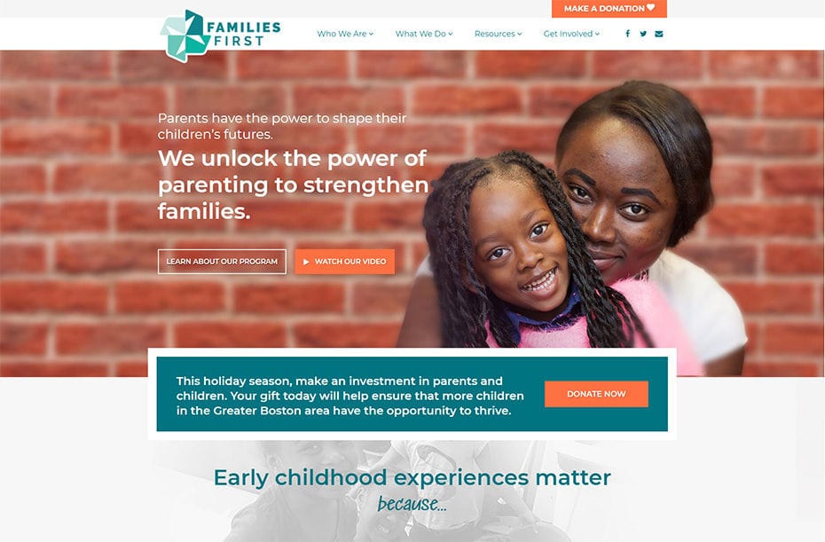
The new website leads with strong visual assets and messaging in order to motivate parents, donors, foundations and partner organizations.
How to save money while arriving at a great design?
Because the Families First team worked with a teen employment organization called Artists for Humanity on a logo redesign, we tackled the new website in two phases. In the first phase, we invented good colors to enhance the existing pallette, worked on the information architecture, and put in place clear messaging. In the second phase, with the new logo in hand, we were hired again to do a color refresh. This approach allowed for cost savings and for a collaboration with an inspired group of students.
A Modern Look and Feel
Before the redesign, the Families First website was not responsive or mobile friendly. The use of very small images throughout gave it an outdated look, which was more appropriate for smaller desktops. The new design makes use of big, bold pictures of families, which makes the site more immersive, modern, and engaging.
Enhancing User Friendliness and Clarity
When we looked at the navigation of the old site, it was clear that the drop-down menu had too many items, which undermines clarity and frustrates users. We worked to eliminate, group, and combine items to help the navigation become clear and concise. With the content of the website already strong, it was a matter of prioritization and organization to help users navigate it better.
Colors make all the difference
The colors on the old site were dull and uninspiring, so we sought to find colors that create energy. We worked within the old color palette to create consistency with the previous look and feel, but made the site feel more light, vibrant, and inspired.
Messaging
Our design made use of the team’s strongest visual asset, which was great pictures of families. We put those front and center and also helped make their existing video highly prominent. Using existing assets further facilitated project management efficiency and cost savings.
We collaborated with internal copywriters to help tease out the strongest and most motivating headlines and calls to action. In addition to ensuring the navigation was seamless and clear, we ensured all website headlines were brief and readable.
Planning for easy content updates
Parenting stories stand at the core of the new site, and we made sure the Families First team can easily update them and add more. The same goes for the parenting tips section of the site. With a budget-driven redesign, it is important to empower the client with the tools they need to take the reins on content editing and future updates.

